A Field of Colour & Tony McGillick, a Retrospective
- May 21, 2020
- 10 min read
Updated: Dec 8, 2024
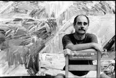
Paul wrote the main catalogue essay and co-curated a major retrospective of the paintings of his late brother, Tony, for the Macquarie University Art Gallery, A Field of Colour – Tony McGillick, a Retrospective (July 9 – September 10, 2018).
FROM IDEA TO VISION
Tony McGillick
Taking Painting Seriously
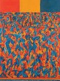
Primary 1965
In 1978, there was a major survey exhibition of the work of Tony McGillick at the National Gallery of Victoria curated by Robert Lindsay. I wrote the catalogue essay and began with a quote from the American abstractionist, Clyfford Still, a painter Tony admired. Now, for the first major survey of Tony’s work since that exhibition, it is worth re-visiting what Still had to say about retrospectives (in the catalogue to a survey of his work 1936-57). He presented the work, he said, with “the hope to make clear its conceptual germination of idea and vision, without which all art becomes but an exercise in conformity with shifting fashions or tribal ethics”.
Still’s comment reveals the fiercely ethical conviction which governed his practice. It was a conviction that Tony shared, as was clear in a personal statement in the 1978 catalogue:
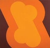
Untitled 1966
In other words, the context of exhibiting paintings was crucial: it had to support the seriousness with which the paintings had been made, otherwise the values which informed those paintings risked being compromised. So, perhaps it is not so surprising that, apart from solo shows at Central Street Gallery in Sydney and Pinacotheca in Melbourne in 1968, Tony never exhibited except for a number of group shows. At the time of his premature death in November 1992, he was preparing his first solo show since 1978 at Sherman Galleries in Sydney – a show which was to signal his total commitment to painting and his final break with advertising from which he had earned an income, more or less without a break, throughout his adult life.
This wariness about the context of showing the work extended to selling it. Objecting to the commercialisation of art, he wouldn’t sell a painting without the guarantee that it would never appear on the secondary market. As a consequence he sold little except to institutional collections.
Painting was a serious business – and an intellectually rigorous one. While this retrospective exhibition clearly reveals the intuitive and strongly emotional character of Tony’s work, the actual practice was highly rational and had to be unambiguously centred on an ‘epistemology’ of painting: a clear understanding of what painting was, what made it unique and how it related to the great Western tradition of easel painting. Crucial to this was a clear acknowledgement of one’s influences and a commitment to confronting those influences and working through them.
Which brings me back to Still’s remarks because, while some artists can bear the scrutiny of a retrospective exhibition, many can’t. Still implies that there has to be a consistent through-line, a steady investigation of how the idea becomes vision – how consistent intellectual premises become realised as concrete visual artefacts marking the stages of an ongoing artistic journey of exploration. If this is absent, a retrospective will expose the lack of integrity in an artist’s œuvre.
I use the word ‘integrity’ advisedly. Firstly, it describes how an artist’s output over an entire lifetime holds together as evidence of a single-minded quest. But it is also applicable to individual works of art which – if we can say of them that they are successful – exhibit integrity or, to use Clement Greenberg’s preferred term, unity. “Unity, he said, “is the first requirement of a work of art.” And elsewhere he comments that “The task of art is to impose the greatest possible organic unity upon the greatest diversity.”
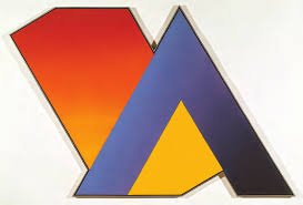
Spraygun Virus 1969
It always struck me how comprehensively Tony had internalised Greenberg’s position on modernism. Certainly, Tony was an admirer. In 1980, when Greenberg was in Sydney for the Dobell Lecture, Tony organised a kind of seminar between Greenberg and a group of local artists at the former Central Street Gallery space. But was it a case of Greenberg simply articulating an approach which Tony had already arrived at independently?
Key elements of that approach included the idea that what mattered was not what art meant, but what it did; that painting was essentially non-referential; that there is a constant tension between what is represented and how it is represented; and the importance of ongoing critical reflection – that art cannot take its medium for granted and that it is in a constant dialectical relationship to the past with an obligation to constantly “make it new” as Ezra Pound famously said.
This suggests a didactic approach and his early work was indeed didactic – setting up propositions in order to test them. Up until the late 1970s, Tony’s paintings were based on working drawings and transferred to canvas largely without any change. Nonetheless, there is from the beginning a strongly personal element, a gestural and intuitive character, a delight in colour and in the materiality of painting.
Painting in Series
Imogen’s Ensign 1973
He always painted in series with each series investigating a particular proposition. Once again, though, the value of this retrospective is that we can see how certain themes link the whole career and how elements from one series get ‘cannibalised’ in subsequent series. But overall I think we can see a shift over 25 years from the polemical to the personal, from the institutional to the domestic.
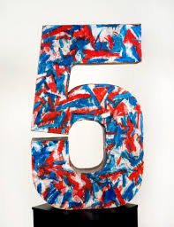
In the 1978 catalogue Tony drew attention to the “procedural nature of my development through various influences and techniques”. This process begins with the first (barring juvenilia) series of paintings (and sculptural numbers, such as Five and Two) which show him confronting the influence of Jasper Johns: the use of a token iconic image stripped of any narrative content through over-use to act as the ‘subject’ of the painting and the use of oil paint and wax mixtures (encaustic) as an expressive impasto material (in fact, Sharman Repeat and Sharman 1-6 from 1964 anticipated this move with the use of the well-known Jimmy Sharman Boxing Troupe as a token subject and expressively painted in oil on canvas).
Tony’s token icon was the front cover of Time magazine whose covers then were far more expressive than its present day photographic covers. And it featured the font, Times Roman (later to re-appear in Tom’s Toybox, 1986 and some other pictures), which was an ironical comment on Tony’s dual personality as painter and advertising artist – irony also being a characteristic of Johns. The encaustic medium ensured that everything happened on the surface (no illusion of depth with its implication of representation), while the primary colours – again anti-illusionist – with the odd star hinted at the pervasive Americanism which Time magazine embodied.
The next two series, in fact, overlapped. Paintings like Toledo, Shchukin (1966) and Untitled (1968) used primaries, but in a flat, non-expressive all-over treatment and employing ‘jellybean’ shapes as their ‘subject’ which were a cross between an arrow head and a split tail. At the same time, Tony began exploring modularity, using squares with one corner cut off and the pieces bolted together to make up a dynamic family of forms – actually inspired by the sleeve in Titian’s Portrait of a Man (Man witha Quilted Sleeve) and possibly encouraged by the English painter, John Walker who was then using a repeated abstract image derived from Velasquez.
Tabby’s Tantrum 1978
The series was flagged by Jasper’s Gesture (1966), a four-part construction of corner-cut squares each in an individual tone but with subtle modulation of the surface and the barest suggestion of tonal depth. Particularly interesting is Republic, painted for the didactically-driven Black and White Show at Central Street Gallery in 1967. Tony subsequently (in 1970) painted over this three-panelled black acrylic and wax painting in encaustic green, leaving the black as under-painting and introducing an expressive gesturalism in the paint application – “to take it out of the schoolroom” as he later put it, making it less didactic and more expressive.
Forming a kind of sub-set to the corner-cut square constructions were five constructed (but non-modular) paintings beginning with Spray Gun Virus (1969) which incorporated the cut-square shapes but which were dominated by a powerful V-shape. For these, primary colours were applied using a spray gun (possibly inspired by James Doolin’s arched paintings shown at Central Street Gallery in 1970, but of which Tony had foreknowledge) to set up subtle tonal shifts across the surface. These paintings were concerned with reconciling objective and subjective perception – namely, what we actually see and how the brain interprets what we see. The corner-cut square, of course, strongly implies an isometric box and, therefore, depth. But the V-shape is uncompromisingly two-dimensional. At the same time, there is an implied gravitational disruption, a kind of embodied vortical impulse (as is also the case with the modular paintings) as the massive V-shape seems about to pull the whole thing around and down. So, there is both an axial and a perspectival tension confronting the viewer who then becomes a participant in trying to resolve a seeming visual paradox. In this way, the experience of the painting becomes an analogy to how we visually process the everyday world – as we constantly tussle with often apparently contradictory visual cues.
All these constructed paintings dispense with the traditional ‘window frame’ to stand alone as non-referential visual statements. Moreover, they create their own language (language being another Johnsian preoccupation) where the parts form a group identity – or language – which is greater than the sum of the parts themselves.
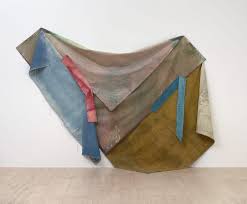
The small group of unstretched canvases beginning with Imogen’s Ensign (1973) and Bivouac (1974) mark an almost entropic conclusion to the various investigations so far. Or perhaps they represent a kind of muted implosion because they are made up of the same canvas segments as the constructed paintings, but with the colour stained into the canvas, and pinned casually to the wall – as though beyond resolution as orthodox stretched paintings. But their very ‘disarray’ seems deeply personal and strongly emotional. They represent an end, but also a beginning.
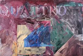
Quattro 1989
Paintings like Tabby’s Tantrum (1978) and Manœuvre (1978) are ‘worked’ paintings, no longer based solely on preliminary drawings but the result of constantly re-working the surface. These paintings hint at a frame within a frame with angled bars pushed to and sometimes beyond the edges with a densely painted internal field. They are personal, they are domestic and – while they continue to be all-over paintings and use the remnants of earlier formal elements, even re-introducing the Times Roman font in some pictures like the later Tom’s Toybox (1986) and Quattro (1989) – they leave behind all vestige of the didactic. Quattro, in fact, is almost a summing up. ‘Quattro’ probably refers to the Quattrocento – the 1400s in Italy and the painting of that era – which, for Tony, was the great reference point, dominated as it was by Piero della Francesca, seen by Tony and many of his contemporaries as the key proto-Modernist. So, the typographic ‘Quattro’ is code for where this painting has come from, along with the three cut-corner squares which now merge with his newly liberated, scumbled and high-keyed surface.
Beyond the Didactic
Five 1965
The decade after the 1978 Survey show at the NGV was not exactly a fallow period, but it was certainly a very private and introspective one as Tony took on the challenge of finding his own voice, of going beyond the polemical. If art was autonomous, then this surely implied that the artist was also autonomous and not a slave to ideology.
There were long, late night hours in the studio (initially on the first floor of the former Central Street Gallery building in downtown Sydney, later in the downstairs space) after a day of work in the advertising studio. It was a time of rigorous self-questioning. Not all of the work which resulted was successful, but when it was – some examples being Tom’s Toybox, Starters Orders (1984), Watagan (1984) and Talisman (1992), all oil and wax on canvas – it shows a strong all-over unity, with generally richer and more extroverted tones and a new, celebratory freedom in applying the paint.
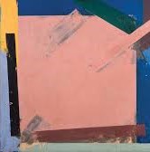
The oil and wax on canvas paintings of the 1980s often employ an explicit ‘frame within a frame’ along with vestiges of the cut-corner squares, even explicit isometric box forms whose implied depth locks into a dynamic tension with the all-over, richly coloured and deliriously free paint work. Epitomising these themes and highlighting Tony’s infallible sense of scale and instinctive feel for the unity of a picture are the two square oil and wax paintings on canvas from the IBM collection from 1990-91. Especially when seen as a pair, these paintings highlight how he would take a set of certain given formal elements and explore a painterly proposition exhaustively, except now in the spirit of free inquiry rather than in the earlier didactic mode.
If the decade after 1978 was one of struggle, one thing Tony never lost was an infallible sense of scale and balance, an instinctive feel for colour, an unmistakable individuality and a capacity for pictorial invention.
This reaches its apotheosis in the final few years (from 1989, but primarily 1991-92) with the oil and wax on paper paintings. Having never worked on paper before – excepting, of course, the advertising work, some caricatures and theatre posters – Tony relished the luminosity which the white paper support provided. It was also the perfect collaborator as Tony’s newfound painterly spontaneity played out a dance with the orthogonal structural elements which had persisted right from the beginning. The largely square formats sustained that perfect sense of scale – now smaller and more domestic than institutional – as the pictorial elements reverberated within the new ’window’ of the frame.
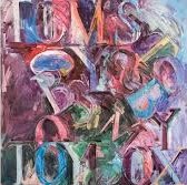
Tom’s Toy Box 1989-1992
For me these late works are sublime, not just for their painterly qualities, but also for the way they reveal, in a totally new context, Tony’s outstanding graphic ability – an ability previously restricted to graphic design and a few caricatures. Their public exposure has been limited, but Elwyn Lynn, reviewing the Sherman Galleries show in February 1993, called them “masterpieces”. These late works on paper are exhilaratingly calligraphic in inspiration, foregrounding an impulse which had previously emerged only intermittently – for example, in the typographical gestures of the early paintings.
They are also a celebration of colour. Always a gifted colourist, his late paintings liberate colour, but also remind us that in a crucial sense, colour had always been the true subject of his painting.
Impulse, material and expression come together in these late oil and wax on paper works in a totally satisfactory conclusion to a career tragically cut short and promising so much still to come.
Paul McGillick, June 2018.
[i] A smaller survey curated by the late Bill Wright was mounted shortly after his death by Sherman Galleries in Sydney in March 1993. Then, in November 2000. Tom Langlands curated a small survey entitled The Sense ofMaking:Tony McGillick – Selected works from the 60s, 70s and 90s. The show consisted of 24 works, including the sculpture, 5, and was held in Tony’s Annandale studio.
[ii] Clyfford Still, Introduction to the catalogue for Paintings by Clyfford Still, Buffalo Fine Arts Academy, 1959.
[iii] These included exhibitions during his years in London: Young Commonwealth Artists’ Exhibition, RBA Galleries, London and Commonwealth Gallery, Edinburgh as part of the Edinburgh Festival, 1962; Group Exhibition, New Vision Gallery, London, 1965; Australian Painting and Sculpture in Europe, Folkestone Art Centre, England and Städtliches Kunstinstitut, Frankfurt, Germany, 1965.
[iv] Cited in Donald B. Kuspit, Clement Greenberg: Art Critic. University of Wisconsin Press: Madison, Wisconsin, 1979. p.30.
[v] Cited in Kuspit, p.34.
[vi] Elwyn Lynn, “Capturing the new shape of abstraction”, in The Australian Weekend Review, February 20-21, 1993.


